Typography
Carbon provides two type sets that support both productive and expressive moments. Primarily, productive was designed for product and expressive was designed for web pages, but there are opportunities to blend contrasting moments to provide clarity through hierarchy, and elevate the overall experience.
Overview
Within Carbon, there are two type sets available for use with productive and expressive moments. The productive type styles were developed for product design, and the expressive, more editorial type styles were developed for IBM.com website pages.
The overarching rule has been to use the productive type styles for product design and the expressive for editorial pages. For the most part, this is still a good guideline to follow. However, there are situations where we can create contrasting moments that better support the user’s intention or task.
Let’s look at the respective design rationales for each experience, and then see where it makes sense to provide a blend.
Productive use cases
Carbon Design System started as the design system for Cloud console and provides typography that supports productive use cases.
When to use productive type styles
The key drivers for the use of productive type styles are:
- Users are focused on getting a specific job done.
- Interactions are more active, through inputs, forms, and controls.
- Users are embedded within the experience, often on one page, for awhile.
- Key performance indicators consider success in terms of time needed to complete a task and also the abandonment rate.
Given these considerations, space efficiency is key. Keeping content condensed is helpful to support focus on complex tasks.
Styles for productive moments
To create productive moments, use the body styles and supporting styles with the
01 suffix, as well as the fixed headings.
To ensure consistent line heights, use the following pairings:
- pair
body-compact-01with theheading-compact-01 - pair
body-01with theheading-01
Productive headings are fixed.
Expressive use cases
Carbon for IBM.com is for the creators of IBM.com and it provides typography that supports expressive use cases.
When to use expressive type styles
The key drivers for the use of expressive type styles are:
- Users are trying to learn and explore, and are primarily scanning and reading.
- Interactions are more passive through impactful imagery, layout, and long form reading.
- Users typically traverse a series of pages during one session.
- Key performance indicators consider success in terms of click-through rates and final purchases.
Given these considerations, larger type sizes and a more editorial approach allows users to scan, read, and navigate multiple pages with comfort and ease.
Styles for expressive moments
To create expressive moments, use the body styles and supporting styles with the
02 suffix. There are also two fixed headings, as well as fluid headings that
will adjust with different breakpoints.
For the fixed headings, ensure consistent line heights by using the following pairings:
- pair
body-compact-02with theheading-compact-02 - pair
body-02with theheading-02
As well as these two fixed headings, there is a set of fluid headings that add a series of scales and fluid behavior.
Blending type sets
The spaces we are designing for are no longer neatly divided between productive and expressive. Both product and web pages can be blended with what we call “moments” if the alternative type set better supports the function.
Users working in product pages benefit from an expressive moment for easy reading or a pause. In these cases, however the “moment” would span a full page or banner where there are no containers.
If your users are working in a product but pausing to read or scan for options, an expressive moment can facilitate easy reading and/or create a desired impact or pause. In these cases, however the “moment” would span a full page or banner where there are no containers.
If your users are on the website and reading, but then switch to a focused task within the web experience, using productive styles within that component would facilitate focus.
Using productive moments within IBM.com pages
Here are some of the places the Dotcom team uses productive moments:
- The global masthead mega menu
- IBM.com search
- Commerce
- Product configuration
- Account creation
- Filter panel in catalogs
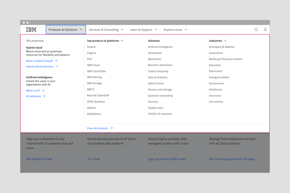
The mega menu with the more compact productive type styles allows users to see the full range of offerings.
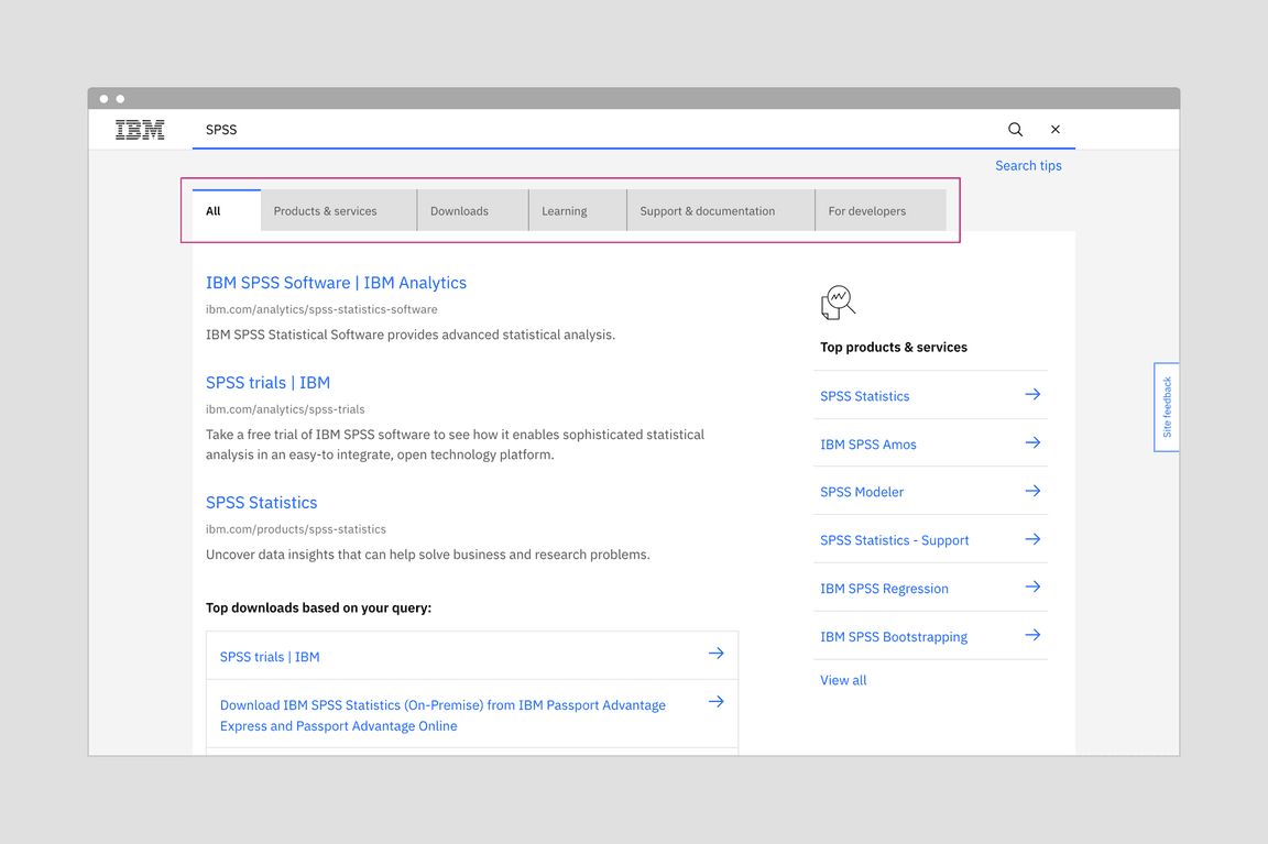
Using productive type styles on tabs provides a distinction in scale. It creates a hierarchy that keeps focus on the results.
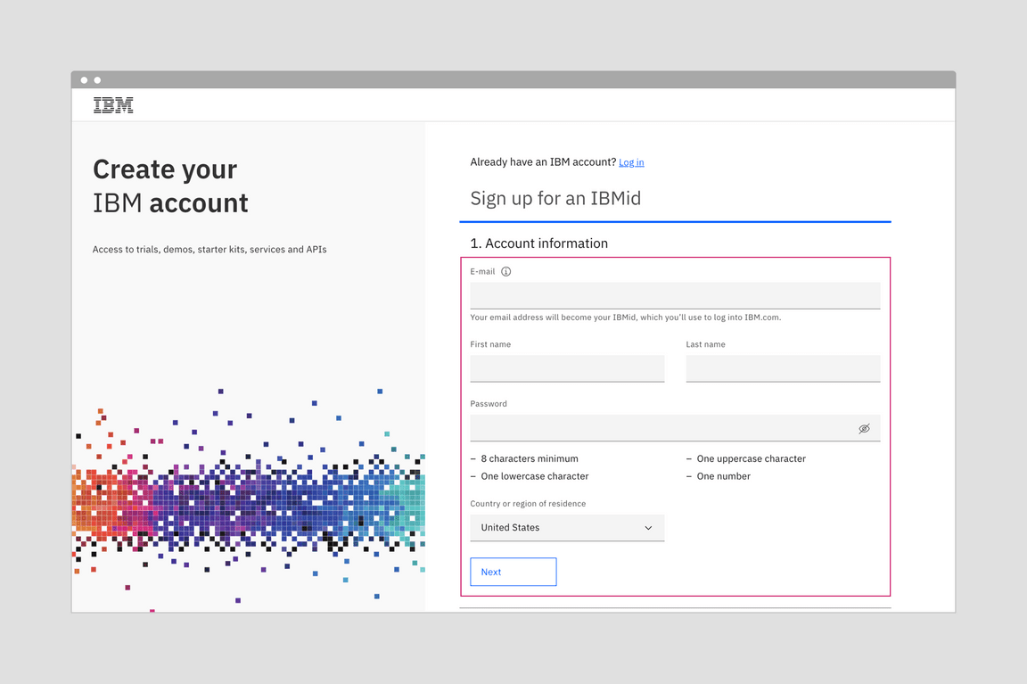
Account creation form with expressive type on the left, and productive type for the form interactions on the right. It shows how both type styles can work side by side.
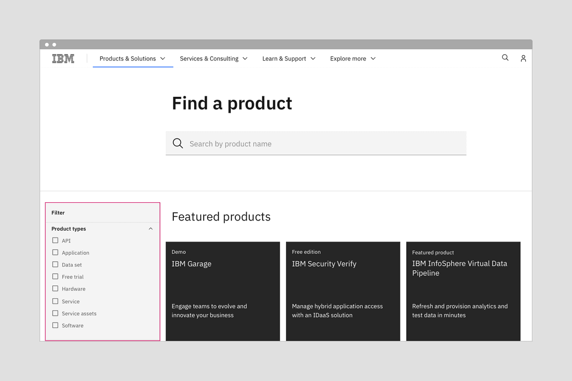
Juxtaposing productive type within an expressive page is a useful tactic for creating a setback or a hierarchy.
Using expressive moments within product designs
The productive experience is all about keeping the user focused and able to complete complex tasks, therefore the areas where expressive moments can be used are less common. However, when the user is first entering the product, or moving to another area of the product you may find opportunities.
For expressive moments, you are looking for areas where the page opens up and the content is not restricted to a container, card, or data table. Home pages and page headers or banners are two possibilites.
For more details about home pages, IBMers can reference the World overview page pattern in the IBM Cloud library.
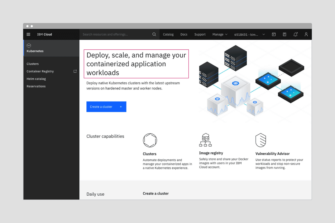
A product home page provides an opportunity to create both visual interest, distinction, and hierarchy with a blend of expressive and productive type styles.
Tips and techniques
Use a blend of the two sets to establish distinctions and create hierarchies
You can use the two type sets to provide contrast and hierarchy within two areas. For example, the filter panel using productive type becomes less prominent next to a list of results using expressive type styles. You can push the functional elements into the background, while keeping the items of user interest in the foreground.
Match and support user tasks
Within each type set, there are appropriately sized type styles for each user task. Follow the use case definitions for expressive and productive moments to determine when it’s appropriate to use each type set.
When users need to focus on a task and are interacting through inputs, forms, and controls, use the productive type set.
When users are learning and exploring, and interacting through impactful imagery, layout, and long form reading, pull from the expressive type set.
Keep type styles consistent within a discrete task, component, or region
People unconsciously use type size as a signal of hierarchy, and each type set has been designed with expectations about hierarchy in mind. Mixing type styles within a component could jumble the hierarchy and create confusion.
Questions?
For IBMers only: If you have any questions about using either of these experiences, reach out to the teams on Slack or sign up to share your work in a review.
Carbon Design System
- Slack channel: #carbon-design-system
- Meetups with Carbon Design System
Carbon for IBM Dotcom
- Slack channel: #carbon-for-ibm-dotcom
- Office hours with Carbon for IBM.com. See our Slack channel for details.